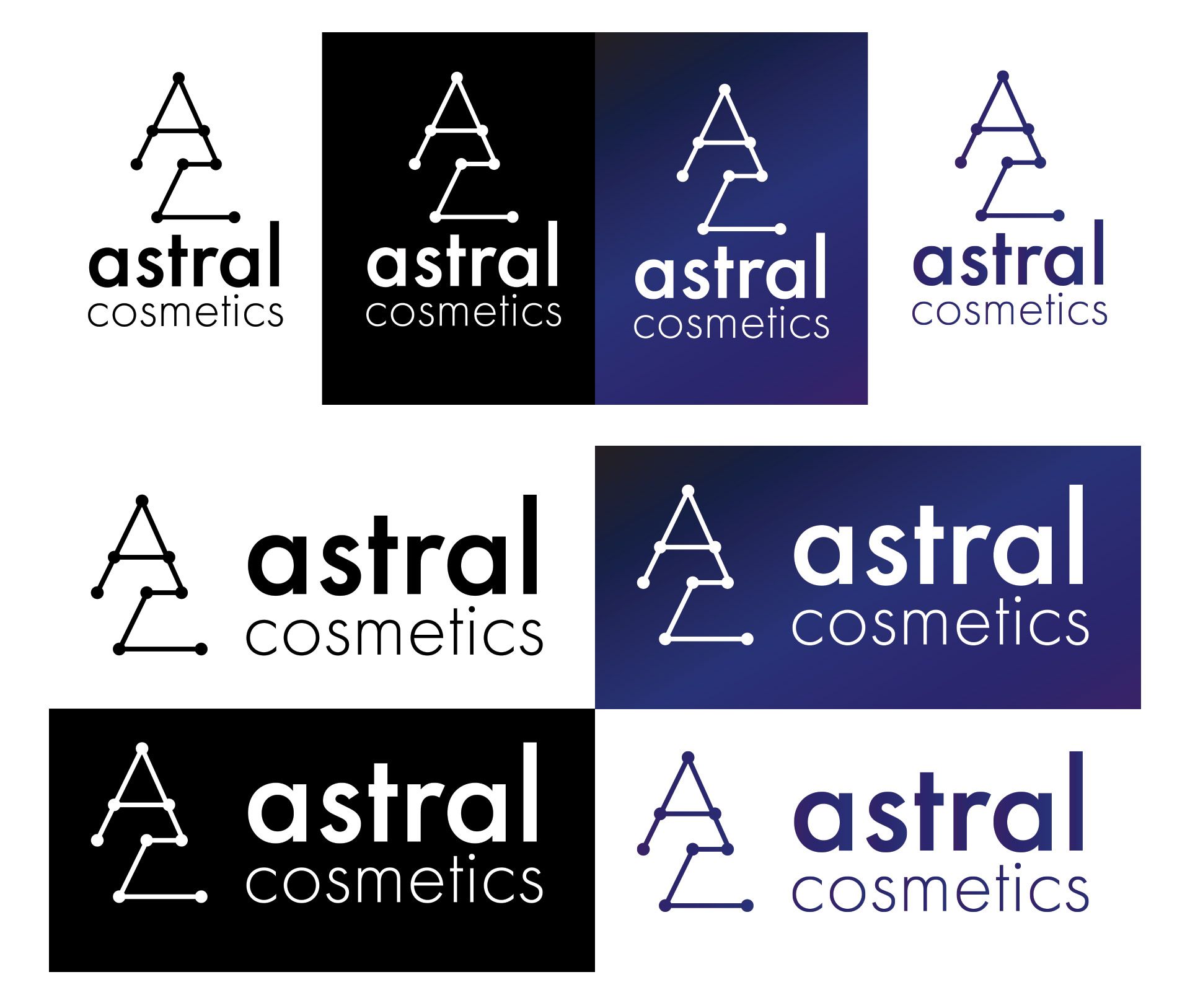
Obie Rifai Designs


X
images/Astral Cosmetics Case Study

Astral Cosmetics Case Study

The goal for this project was to create a brand identity, packaging design, and landing page design for Astral Cosmetics. Astral Cosmetics is a premiere cosmetics brand focused on delivering high quality cosmetics and beauty products to their consumers.

Role: Art Direction, Design, Graphic Design, Web Design, Brand Strategy, Brand Design

images/Astral Cosmetics Case Study
Obie Rifai

About The Brand

Astral Cosmetics is a premium cosmetics brand focused on delivering the highest quality of products to their consumers. Ranging from shampoos to rejuvenation creams, Astral Cosmetics puts a focus on ethically sourced ingredients that are cruelty free and vegan friendly. The main focus of the brand is to give their consumers the best option when it comes to choosing cosmetics while being aware of their carbon footprint and effect that they have on this planet. 

Challenge

I was tasked to create a brand identity, which included a logo and various packaging designs for their collections. The goal was to keep the space look as they wanted their brand to seem vast and cosmic. They also wanted to make sure that their packaging had a premium look, as their product is in the higher price range for cosmetics. I was also tasked with creating a landing page for Astral Cosmetics. For this page they wanted a strong focus on their brand imagery, but wanted to keep the overall design minimal and clean.   

Exploration

I started the process by looking at various websites like Sephora, Fenty Beauty, Estee Lauder, Chanel and more. I've noticed for their logo designs, they tend to vary with the font choice that they use. Something that has been a trend lately is that companies are updating their logos to a sans-serif look. I felt that it was important to go that direction from the start because it looks more modern and since others tend to use a serif font, it would set it apart from the competition. I also noticed that most companies tend to just have a wordmark for their logo. I wanted to not only include that but also have a logomark as well since I wanted a consumer in the long run to associate just the logomark as the brand, similar to the apple or swoosh for Apple and Nike. 

For the website I looked at Sephora and Apple as a main source of inspiration. For higher end brands, a consistent theme was a big hero banner at the top of the homepage that wasn't too distracting, but to make the hero banner clean and minimal. Another thing I noticed was that elements on the page were very minimal with a major emphasis on product images with some descriptive and a call to action. By having a lot of elements on the page and various products, I felt that it makes the page busy, making it harder for the user to focus their attention due to all of the elements. Some other things I noticed was that beauty companies tend to have an Instagram feed along with their site. I felt that this was important to consider because social media - especially Instagram - is a major factor in marketing and getting influencers to use your products can make or break a collection. 

Process

Logo

For the logo, I wanted to play off of the cosmic theme that the company wanted to brand themselves as. For the wordmark, I used a clean sans-serif typeface that was easily readable, and had different weights so that I can emphasize different words of the brand. Since I was focused on the space theme, I chose to make "Astral" bolder then cosmetics as that was the key focus of their brand. For the logo mark, I chose a play on constellations that formed an "A" and "C" as those are the initials of the company. This further pushed the cosmic theme and I thought it was a clever play for the logo mark. For the colour scheme, I went with a purple-blue gradient as I found that to portray a more premium look, and I felt that it matched the aesthetic of the logo. I also created a horizontal version of the logo as some of the packaging, the vertical layout wouldn't work as well with the packaging constraints so I felt it was important to do a horizontal version as well. 
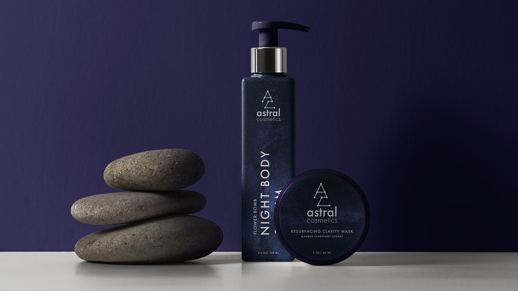
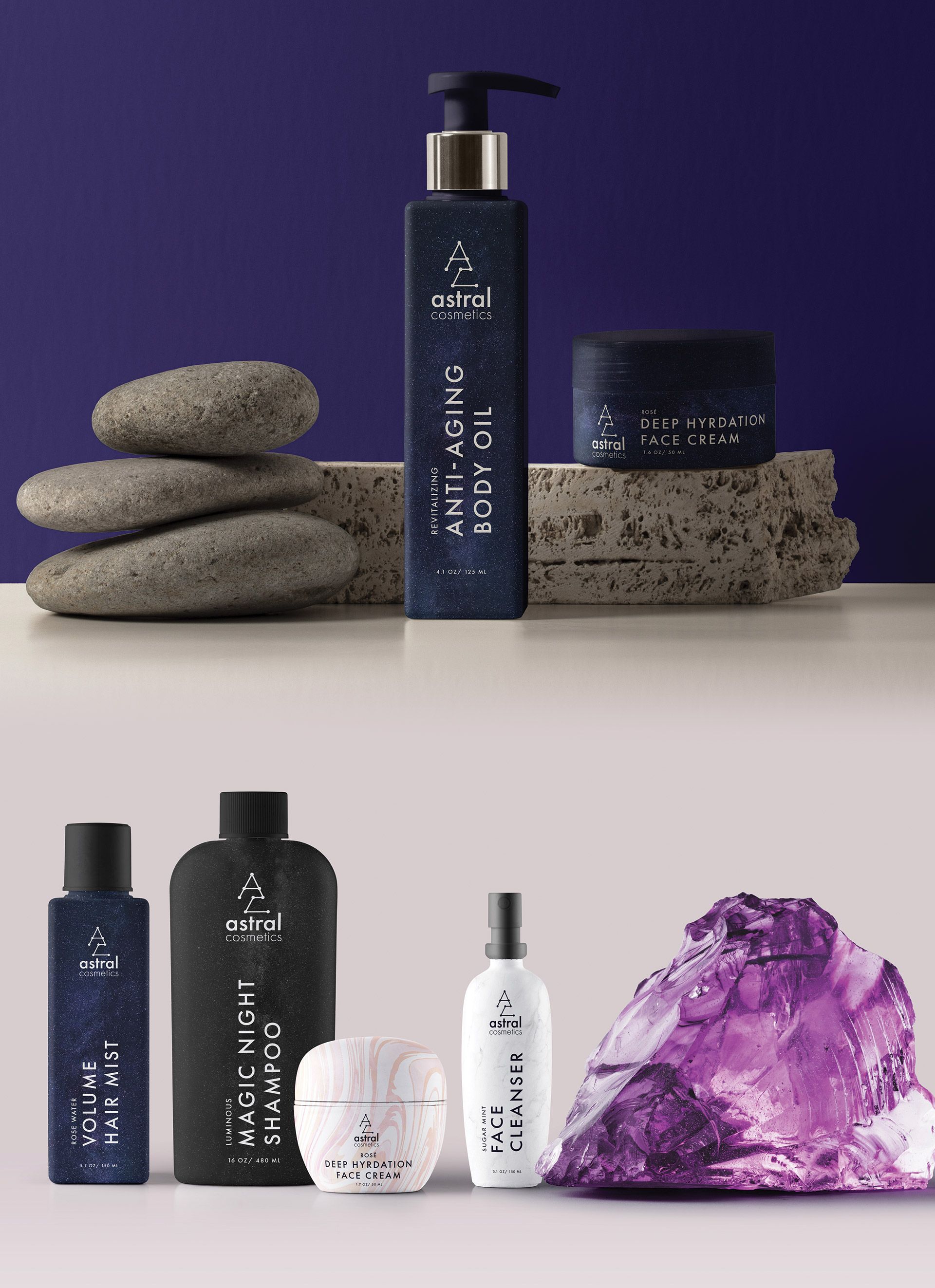
Logo Design For Astral Cosmetics - Obie Rifai Designs

Packaging

For the packaging, I wanted to keep this as minimal and clean as possible. Since Astral Cosmetics wanted to position themselves as a premium brand, I figured that having a clean look to the package was the right direction. For their premiere collection, I wanted that collection to have the cosmic theme seen throughout the brand. I chose to use the darker purple colour with a subtle space background to give it a more interesting design then going for a straight black or white as most brands tend to go with. I felt that it would set it apart on the shelves and people will tend to gravitate towards it as it is different. For the title of the product I went with the same sans-serif font used in the logo to give the design consistency, but rotated the title 90 degrees to give it a different, more interesting look. I felt that by doing this, it made the packaging look cleaner and differentiates itself from the competition. For Astral Cosmetic's other collections, I kept the title and logo positioning consistent but swapped the backgrounds. I wanted the backgrounds to be clean and elegant, and depending on the type of collection, if it was for an evening type product, I wanted darker backgrounds, and if it was more of an everyday daytime type product, I wanted to use a brighter background. 
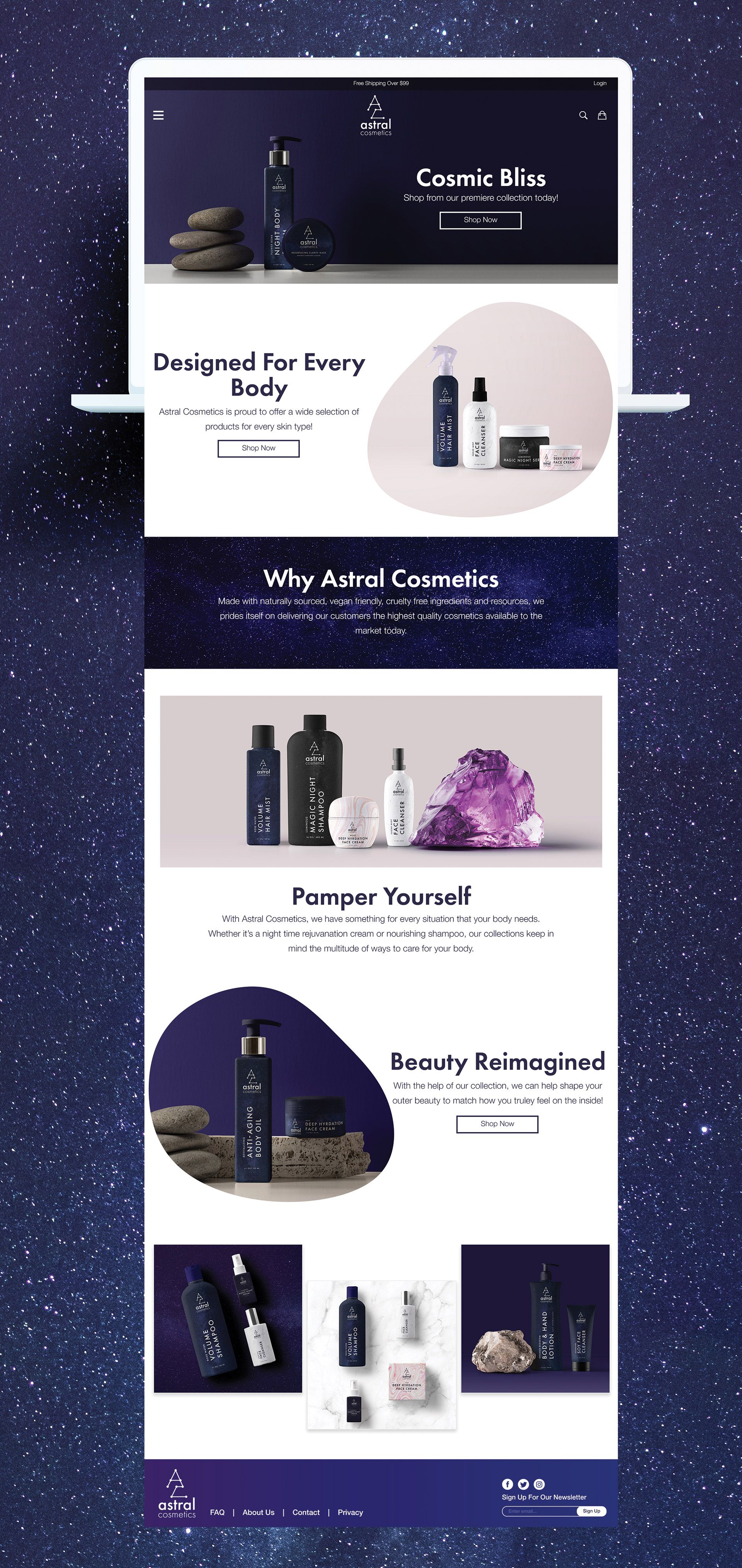
Packaging Designs For Astral Cosmetics - Obie Rifai Designs

Landing Page

For the landing page, I wanted to keep this minimal and really showcase the strong editorials of the products Astral Cosmetics sells. I wanted to have the hero banner be a main focus as that's the first thing a user will see on the site. I decided not to separate the header and the hero banner and made them one element as I felt it was stronger and more cohesive. By not splitting the header and hero banner, it allows for the main image to have more focus and that was a big focus for Astral Cosmetics. For the second banner, I wanted to highlight the different collections that Astral Cosmetics has. I did this by showing a strong editorial of their products from various collections in one product shot, while having a call to action on the left side. I used a blob shape as opposed to a square or circle as I felt it gave it more of a fluid and free look and felt it was consistent with their brand. For the third section I wanted to have a brief description and mission statement for Astral Cosmetics. I felt this was important to include because it allows the consumers to get to know the company more and let the consumers relate with Astral Cosmetics. For the bottom half of the site, I included 2 banners that would push Astral Cosmetic's collections and products further, showcasing their editorial photos, and then have an Instagram feed at the bottom to finish off the design. 

Landing Page Web Site Design For Astral Cosmetics - Obie Rifai Designs

Summary

What Was Done

  • Create a logo and brand identity for Astral Cosmetics
  • Create various packaging designs for their different collections
  • Create a landing page to showcase their brand and products

Outcome

Overall, I believe this project was a success. By creating a new logo for Astral Cosmetics by keeping true to their brand beliefs and vision, it helps position them as a higher end brand in a crowded market. By having a logo mark and a word mark, it makes their logo more versatile, which helps with their packaging design as well. By creating new packaging design, this helps Astral Cosmetics by having a unique look to their package across multiple collections, and gives them the high-end premium look that they wanted. By creating unique packaging and designs, this will help Astral Cosmetics stand out on the shelves and puts them in a greate position to be purchased by prospective consumers. For the landing page, by having a big emphasis on strong imagery and a clean, modern, minimal approach to the design, it positions Astral Cosmetics as a more luxury brand while maintaining their brand story and pushing their collections. 
Direction: Art Direction, Design, Branding, Web Design