Obie Rifai Designs


X
images/Rolling Stones Cover Case Study

Rolling Stones Cover Case Study

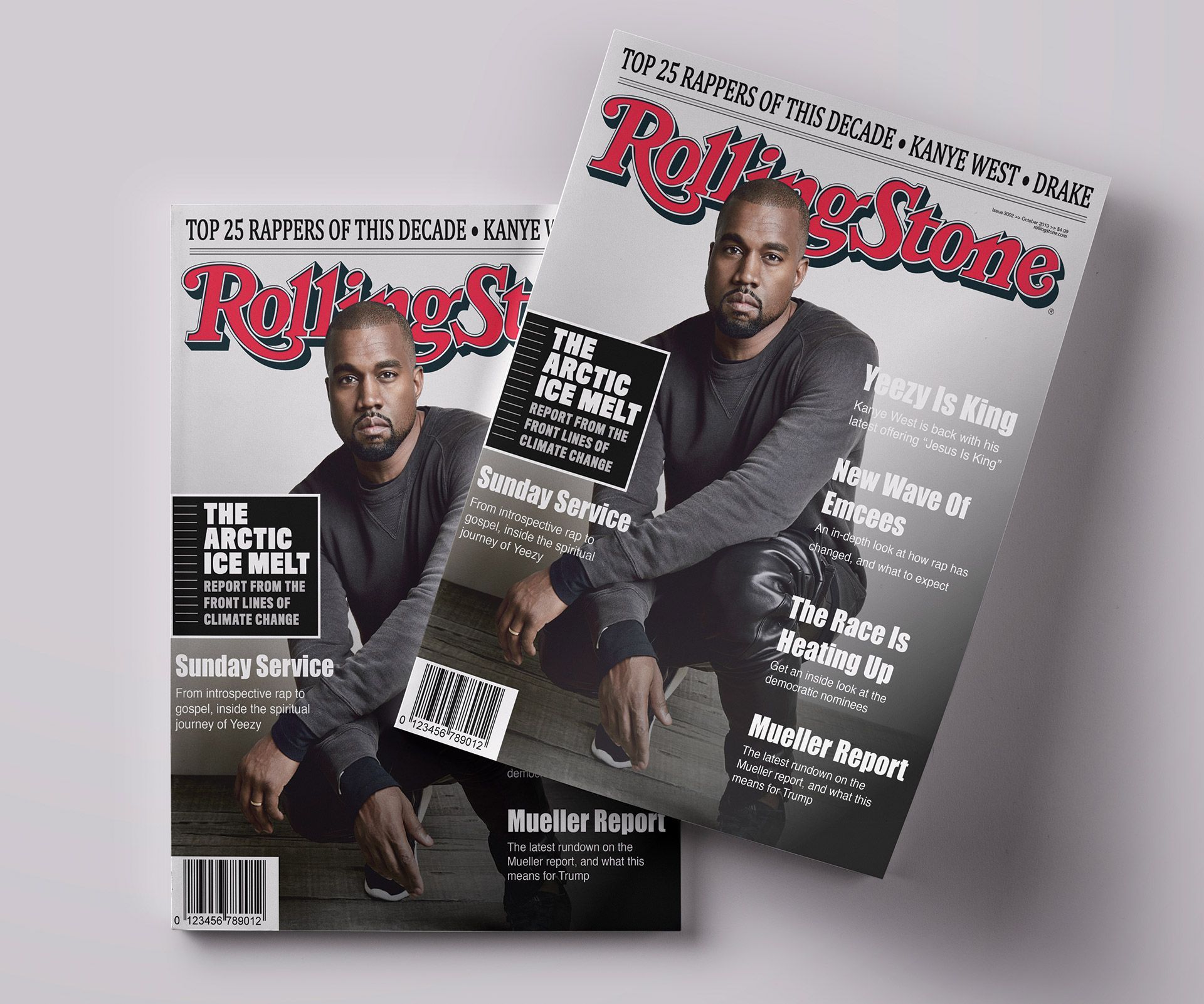
The challenge of this project was to create a Rolling Stones Magazine cover for the artist of my choice, to which I chose Kanye West, and to keep the same branding and guidelines as the magazine would.

Role: Graphic Design

images/Rolling Stones Cover Case Study
Obie Rifai

About The Project

Rolling Stone is an American monthly magazine that focuses on popular culture. It was founded in San Francisco, California in 1967. Focusing on not only music by various issues happening around the world, Rolling Stones is a top music magazine for any fan of the genre. The goal for this project was to create a Rolling Stones cover for an artist of my choice, keeping in line the branding and look of the Rolling Stones Magazine. 

Challenge

The challenge of this project was to create a magazine cover for the artist of my choice. The artist that I chose was Kanye West as he's someone who has influenced me as a creative because he pushed the boundaries with his music and it's something I aspire to do when creating new designs. With that, I also needed to find different headlines for the cover as Rolling Stones doesn't just have the image as it's more then the cover image, and to keep the typography and design consistent with how their magazines currently are. 

Exploration

I started the exploration phase by looking at a catalogue of Rolling Stones magazine covers and breaking down aspects of the covers. I narrowed this down to 2 main elements: the cover image, and the articles their promoting within the magazine. For the cover image, I noticed that most of the images that they used, the cover artist was looking at the camera, and the backgrounds was one colour, usually white. With this aesthetic, it gives the focus entirely on the artist they placed on the cover and the only other elements on the page were the articles within the magazine. For the article typography, there were 2 fonts used, a serif font above the logo featuring an article related to the cover artist, and the sans-serif font that promotes other articles within the magazine. This gives a clean look to the magazine as the reader won't be overwhelmed by the number of fonts used, which in turn makes it more appealing. The last thing that I noticed was that the Rolling Stones logo was always in the same place, never changing its position - front and centre, and sometimes the cover artist will either be in front or behind the logo itself.

Process

Design

I started the process by finding an image of Kanye West suitable to be used for a cover for the magazine. I wanted to look for one with a very minimal background, preferably on white or a lighter colour. I also wanted to find one where Kanye was looking at the camera and wasn't too posed as that is more inline with how Rolling Stones does their covers. I found one that met the requirements that I was looking for and felt that it was a strong image that would draw readers in and had the right look for the cover. Once I found the right image for the cover photo, I switched my focus on headlines and the typographic aspects of the cover. 

I broke down the article headlines for most Rolling Stones covers into 2 main categories: World News, and Information about the cover artist. For information about the cover artist, I found that it was mostly geared towards the latest/upcoming album that the artist has and breaking down their career/life. For the World News headlines, it was more focused on current events happening that readers not really interested in the cover artist may gravitate towards and read. I also noted that the tone of the articles weren't too “clickbaity” like gossip magazines but were more even keel, and not focused on sensationalism to grab a reader's attention. For the typographic elements, I found that most of the fonts used for the articles were a bold sans-serif font for the title, and a lighter sans-serif font for the brief article description. There was an element of each magazine that occurs above the Rolling Stones logo that uses a serif font to link the cover back to the artist as it's appearance close to the logo will give a reader who may not be familiar with the cover artist some basic information as to what the cover story will be about. All of these elements put together made for a cover that looks like it belongs on the newstands and has a consistent look and quality that regular Rolling Stones magazine readers have come to know and appreciate. 

Summary

What Was Done

  • Create a Rolling Stones cover for an artist of my choice, keeping in line with the Rolling Stones branding and cover consistency

Outcome

Overall, this project was a success. I felt that this Rolling Stones cover design maintains the brand's overall look and feel. With that, finding the right image to have as a cover photo that was clean with a non-distracting background was essential to the design as that is what Rolling Stones is known for. By having relevant news headlines to accompany the cover images and info about the cover artist on the photo, adds to the consistent theme of the Rolling Stones covers, and will give readers some insight as to what to expect in the magazine this month.