Research
When looking at designing a media kit, one of the most important things for me was to make sure it that it portrays the message of the brand. Since The Noteworthys we canadian, prided themselves on finding canadian designers with high quality craftsmanship, I felt it was important that the same concept and feel was presented throughout this kit. I looked across the web to find examples of other company’s media kits or brand guidelines to draw inspiration from. By doing this, it gave me a sense of not only what other companies are doing but what key aspects are included in media kits.
Design
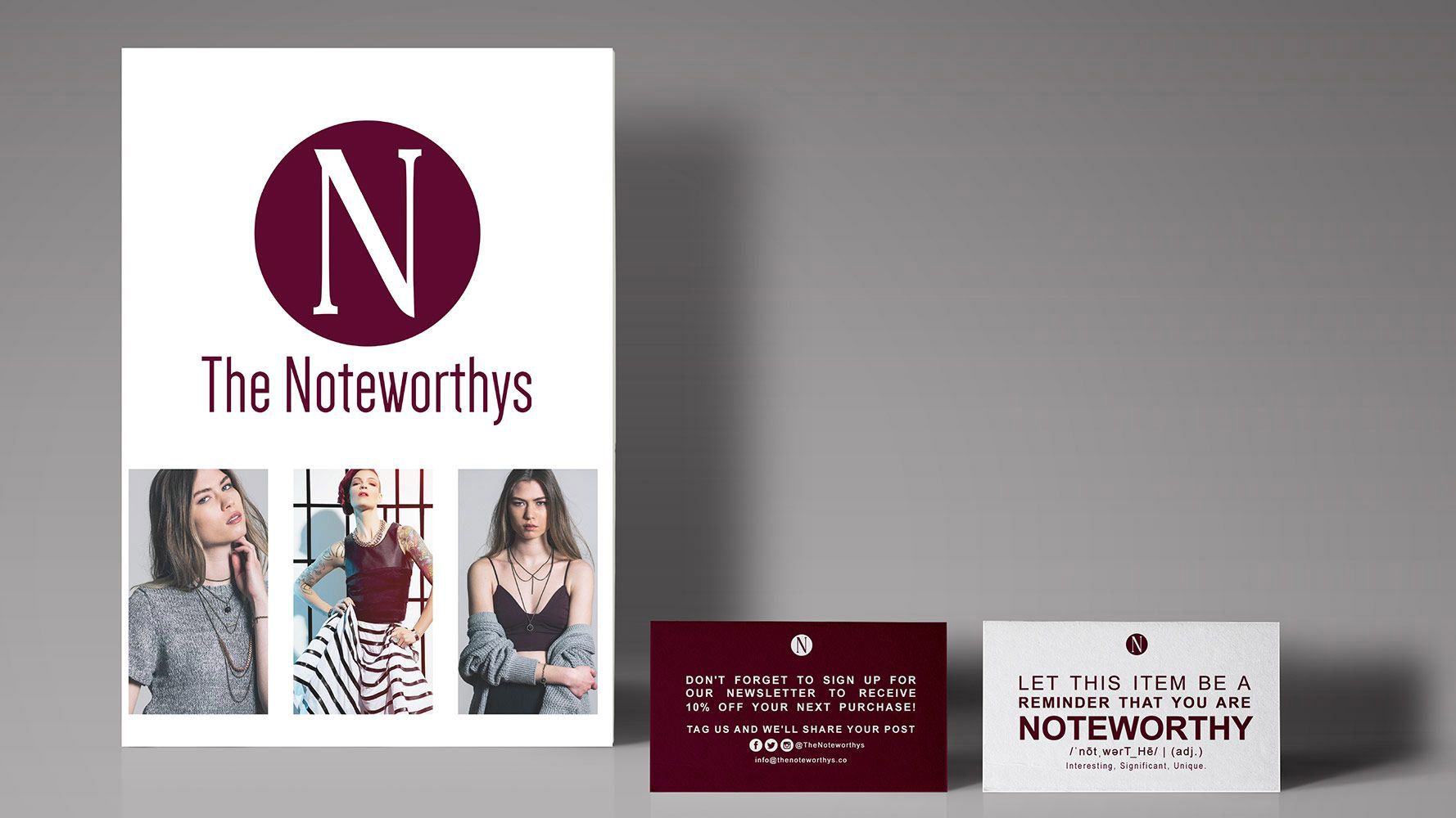
One of the main points that were emphasised in the client brief was the use of images. The Noteworthys wanted the images to be the focal point of the design of the media kit. For the cover page, the goal was to make it as visually appealing but minimal as possible. I chose 3 of their strongest images and used those as a drawing point for the cover. I placed their logo at the top half of the page and the product images at the bottom to give a symmetrical look and occupy the space evenly.

For the second page, the client wanted an about us section, the types of products that they sell, as well as a list of designers they currently carry. It was important for the client to let potential designers know about them as well as their focus, goals, and visions for the company to help others know if their brands will align with one another. I included another product image to keep the balance to the text as well as have that section visually appealing as they are trying to convince potential brands to sell their products to them. For the second section, The Noteworthys wanted to display the types of products they sell. I wanted to use images as well as text for this because having just a standard list wasn’t visually appealing and by including images, it also helps push their brand aesthetic towards potential designers. The last part of the page was a standard list of designers that The Noteworthys currently carry. Originally, I had put pictures of the designers that they currently carry instead of just an ordinary list to keep it consistent with the products as well as make it more visually appealing, but the clients just wanted a standard list as it wasn’t as important as the other elements on the page.
For the last page, the client wanted it to be really straightforward. All that was required was a simple message letting potential designers know that they are excited to work with them, contact info for the person in charge, and the website social media accounts as well as a link to the site.
For the business cards that were meant to go into every order, they wanted it to be minimal yet consistent with their site and branding. The main focus for these cards was to push their brand message of being unique as well as offer an incentive to come back to the site. On one side, it was decided to include a message asking customers to sign up to their newsletters and get 10% off. On the other side was their message of being noteworthy. I prioritized the text and the brand colours without getting too complex and straying away from the message.