Research
I started the research process by going to various sites that I tend to shop at including Nike, Adidas, Footlocker and End Clothing. The main reason I went to these sites were to really examine not only what makes them good, but also why I am drawn to them and the elements that I like the most about them. What I found was that I appreciate a more minimalistic approach in the design but also how they promote their products. I liked how it wasn’t a more “in your face” approach but more highlighting the products using strong images and a bit of descriptive. I feel that by doing that, you allow the product to do the talking and let the consumer form their own opinion on the product with feeling like it’s being pushed on them.
Design
Logo
For the logo I wanted to a wordmark logo based on the fact that most high end fashion and streetwear brands follow that trend. For Northview, I wanted to have a bold typeface san-serif typeface to emphasis the main name and clothing in a lighter font as Northview should be the main point. I also added an arrow at the end of the N to further emphasize the North meaning. With the N being modified, it would also serve as an icon which can later be used as a shortened version of the logo, similar to how Nike has the swoosh as well as their text.

Website
Homepage
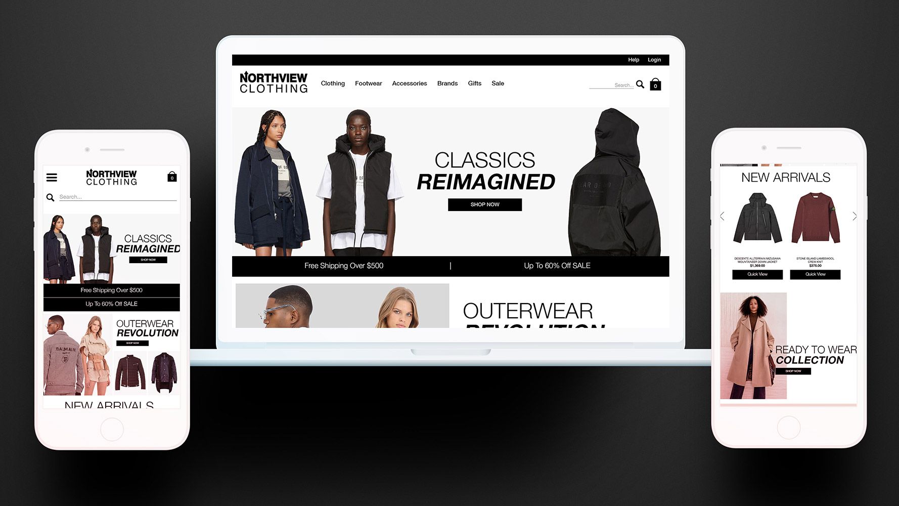
For the homepage, it was important for me to be minimal but with a strong focus on brand storytelling and a major focus on images. I wanted to include the new arrivals for the store on the homepage with a quick view button so that customers will have quick access to those products and easily add them to their cart. Another element that was important to include was an Instagram feed. The reason being is that social media is a major part of the industry and having a feed showing other influencers wearing the product is just another tool to market the brand and tell your own story to differentiate from the competition.

Collection Page
For this section, the filters were the main aspects of this page. While I was going through sites looking at what other brands are doing, and found that the common filters were Size, Colour, Price, Brand, and Style. By including these filters, it will give customers an easier way to narrow down the broad collection to something precise and what they were looking for. Asides from the filters, I wanted the product images to have a consistent look throughout each brand. Also with each product, I wanted to include the title, and the product price as they are an e-commerce staple.

Product Page
For this page, since most brands are image focused, I made sure that the product image was the focal point of the page. Along with the main product image, having multiple views of the products was also important as it gives the customer more information regarding the products. With that, the next important element on this page is the add to cart button. By having that large and black will draw the customer’s focus so they will be more inclined to add to cart. The other main elements that I wanted to push on this page were the title of the product, the price, and the size selection. I made all of these elements above the page fold so that they will be seen by the customer without having to scroll down making it easier for the end user. I put the product description, size chart, and product reviews towards the bottom of the page as customers who tend to shop for these items know what they’re looking for so those elements aren’t as important as others.


