Obie Rifai Designs


X
images/GAP Logo Redesign Case Study

GAP Logo Redesign Case Study

This case study breaks down the redesign I did for GAP's logo. I was tasked not only to redesign their logo but to include a brand identity guideline, as well as create a header and business card with the new logo design.

Role: Art Direction, Graphic Design

images/GAP Logo Redesign Case Study
Obie Rifai

About The Project

GAP is leading global specialty retailer offering clothing, accessories and personal care products for men, women, children, and babies. With more than 137,000 employees and more than 3,100 company-operated stores and more than 350 franchise stores. Their presence is felt around the world. 

Challenge

The assignment was to redesign the GAP logo and create an accompanying brand guideline document to explain the proper use of the logo. I was also tasked to redesign a business card, and letterhead for the new logo design to complete the overall new brand identity. 

Exploration

I started the redesign process by looking at what other clothing brands were doing in terms of their logos and look for recent trends in logo redesigns. I looked at what recent brands like Burberry, Balmain, and Saint Laurent have done with their rebrands and the trend was that they were all going with a more modern sans-serif font for a clean aesthetic. I also looked at brands that are more inline with GAP like Old Navy, J.Crew, and American Eagle and saw that they also range from a wide variety of fonts but that they were all very clean wordmarks. That was the direction I wanted to go with for the GAP logo redesign. I didn’t want to reinvent the logo or add anything to distract from the brand that people are already familiar with, I just wanted to bring it to the modern era of design.

Process

Design

Logo

For the new logo, the goal was to keep the same feel of the original but put a modern twist to it. I wanted to keep the white font on the signature dark blue square as that will keep the brand familiar with existing customers but modernize it by using a sans-serif font. I didn’t want to introduce any other marks for the logo as I felt it would deviate too far from the original and wouldn’t have more of a negative impact for the staple brand. I went with the sans-serif font “SF Movie Poster” as it keeps the same height and lettering of the original logo but modernizing it by being sans-serif. Since the original font for the GAP logo was a thinner serif, I felt that the new sans-serif font was the right choice as it keeps the thin aesthetic and it’s not too far off from the original. By doing this, the logo redesign is drastic and polarizing, just a modern take on the logo. 

Brand Identity Guidelines

For the brand guidelines, the goal was to create a set of rules for the new logo, while breaking down the design decisions that were made during the logo process. I wanted to keep this clean and easily readable so that people don’t use the logo in the wrong way as it’s the identity of the company. Pages that I included were a brief history of Gap, so that new designers or employees know some background of the company and sets up the logo process. The next page, I displayed the old logo with the new redesign. I felt this was important to show because it shows the subtlety in the redesign so that it doesn’t seem too far and still in line with the original. The next page was showing how to use the logo in a letterhead and business cards so that the logo doesn’t get cut off or it’s used incorrectly. The next 2 pages were the acceptable and non acceptable uses for the logo. It was important to have these so that while creating promotional material, the logo is always used properly to maintain brand consistency and keep the integrity of the logo design intact. The last 2 pages were breaking down the colour scheme and typography for the logo, letterhead, and business cards. This was important to include to maintain the brand identity and not have clashing colours of conflicting fonts for letterheads and business cards. 

Letterhead / Business Card

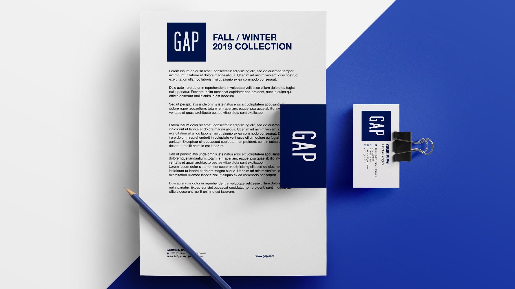
For the letterhead, I wanted to keep this as clean as possible. I put the newly designed logo on the top left of the page and the title of the memo below it to give authority to the logo as it should stand out from the page. The font choice for the rest of the document is Helvetica as it’s a clean font that is widely used across many platforms and its very readable. For the business cards, I went with the same concept of the letterhead. I placed the logo on the left and the contact information on the right. The logo should always have its own space as it’s a key part of the brand. For the contact information of the business card, I used the same font as the letterhead (Helvetica) with the name in bold, and the other information in a normal font weight.

Summary

What Was Done

  • Redesign the GAP logo
  • Create a brand guideline document for new rebrand
  • Create new business cards and letterhead using the new logo

Outcome

Overall, this project was a success. By redesigning The Gap logo with a sans-serif font and keeping the traditional branding, it brings the logo into the modern era while still being recognizable with existing customers. Along with the new logo, the new brand guidelines gives a good breakdown on the decisions made for the new logo design, the acceptable uses of the logo as well as the typographic and colour breakdown for the brand. Also by creating a new letterhead and business card, it wraps up the overall rebrand company-wide.