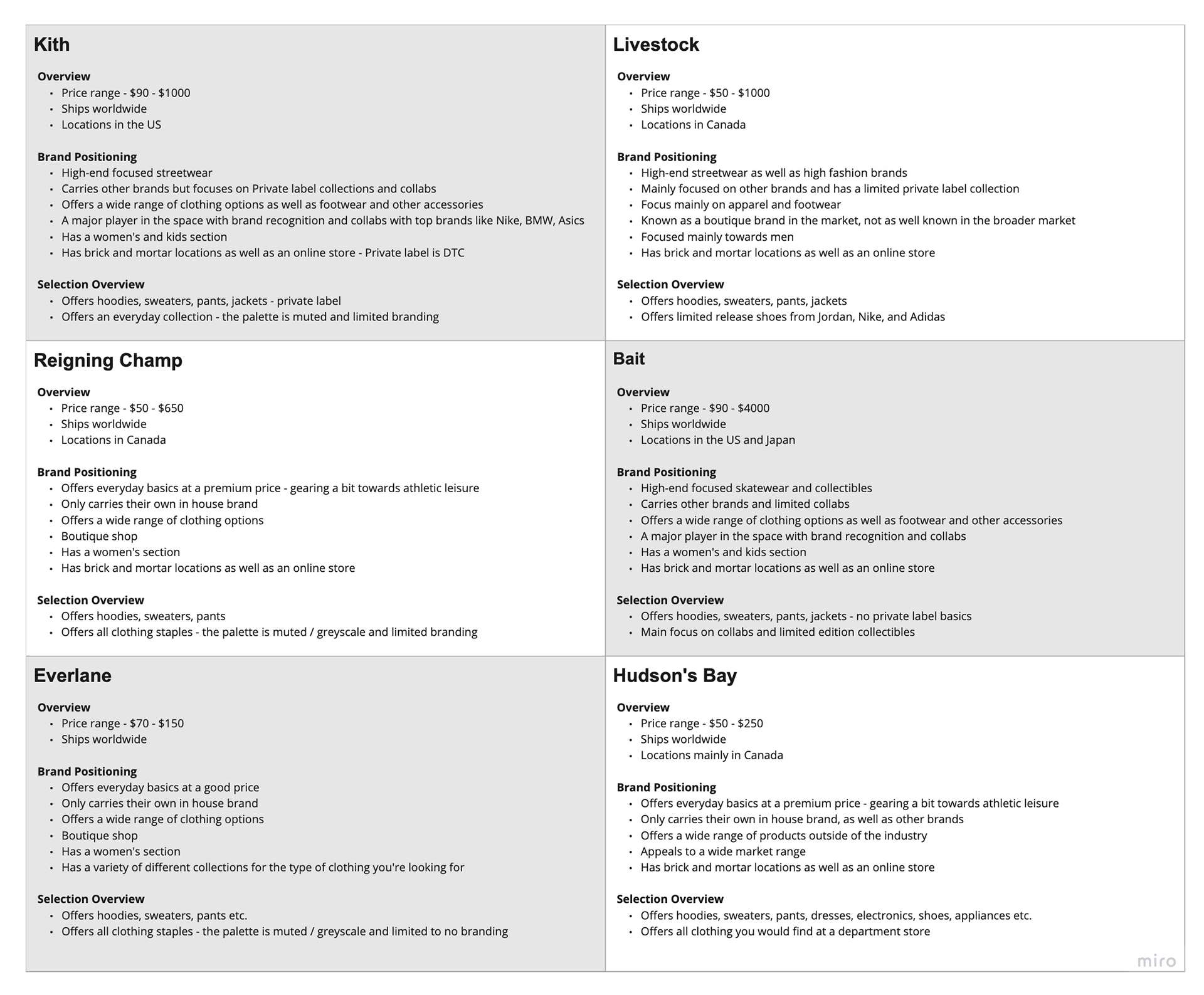
I started the exploration process with a competition analysis of the current clothing market geared towards men. I wanted the brand to have a higher end look but not geared towards the athletic leisure market where I feel is overly saturated and locked in by the top competitors like Nike and Adidas. I also looked into brands that are a bit more affordable in pricing so that it’s more accessible to a broader market but also wanted to have a clear emphasis on materials and longevity. The brands that I decided to focus on were Kith, Livestock, Reigning Champ, Bait, Everlane, and Hudson’s Bay. I chose these brands because they have a focus on the higher end clothing market for men but also focus on the quality of clothing as well as the streetwear and modern appeal to apparel and less on the athletic leisure appeal.

Wireframes
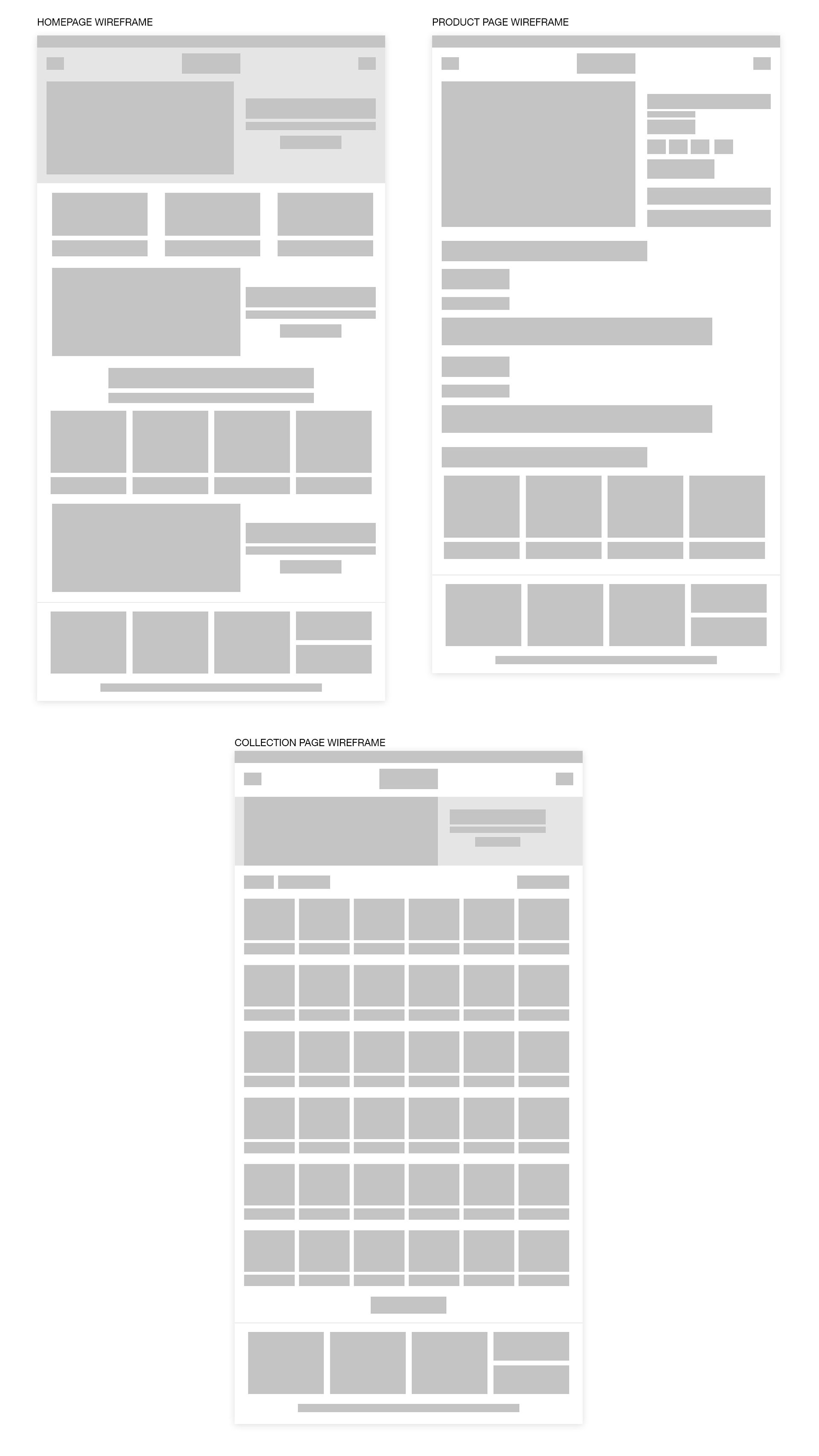
Once I had a good understanding of what the competitive landscape was, I started going into how the sites worked and the key elements for each page that was necessary for an e-commerce site. I focused mainly on the mobile design of the site since the majority of traffic on the web comes from mobile so it’s imperative that the mobile experience is as optimal as possible. The majority of e-commerce sites use the same structure for their headers, logo in the middle, nav on the left and cart on the right, so I opted for doing the same as it would already be familiar to customers and they wouldn’t have to learn a new system in order to shop. For the collection page, I wanted to keep a 2 column grid system to display the items since it’s a visual brand and I wanted to have the images larger, whereas if I went with a 3 column grid, it wouldn’t have been that effective. I also added the filter and sort order button at the top so that it was easier to filter products and having it drop down to expand so that it saves space. On the product page, I wanted the main image to be the focal point and have the secondary images be in a gallery. This helps save space and would eliminate a lot of scrolling had we not gone that way. The other important elements of the product page was the title, price, size selector and the add to cart button. I wanted these all to be above the page fold so that, again, it would eliminate scrolling and make it as easy as possible to see the add to cart button.

For the desktop experience, I kept the same system, but expanded on it so that it was scaled to fit but still recognizable and not feel like a totally different site. I kept the same mobile header structure as it kept the design clean. For the collection page, I went with the same experience again with the filter and sort order at the top and expanded when clicked to keep as much above the page fold as possible. I went with a 6 column grid to display the products because, again, I wanted to keep the emphasis on the product images as that was the main selling point. For the product page, I kept it very clean by having the main image on the left and the product information on the right. After looking at a lot of e-commerce sites, this was the general layout that sites go with so it would be familiar to first time customers as it’s a layout they have seen before. I made sure that the add to cart and pertinent information was above the page fold so that it was easier to see and would eliminate scrolling to add a product to the cart.
