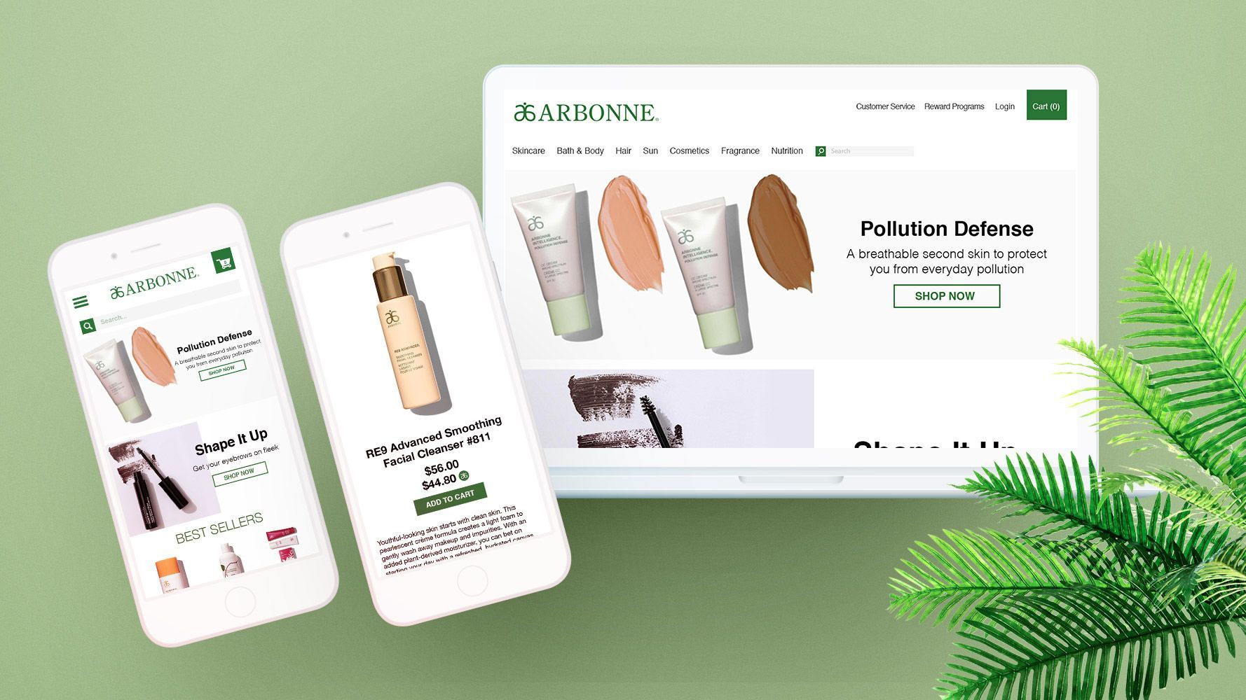
Homepage
For the homepage, I wanted the main focus to be on the hero banner. By having a strong product image that looks all natural puts the consumer at ease knowing that these products aren’t chemically harmful and they may have health benefits. By tapping into this market, Arbonne can effectively go after the all-natural market while being in the makeup and skincare market as well. Along with the hero banner, I wanted to include a row of products that are best sellers. With these products, I wanted to not only let consumers know which products are selling the best but also give them a start into where to shop and push them into the right direction for them. I also wanted to include sections that are more sales driven by promoting new and trendy collections that consumers may be interested in. Another key section was the benefits of being an Arbonne customer which includes loyalty points, free shipping, and savings. Lastly I wanted to include a vegan banner to directly target that market with all of the vegan friendly products.

Collection Page
For the collection page, the main focus was the filter menu. The reason being is with such a wide variety of products with a range of benefits, it’s important for consumers to be able to narrow down the initial results of a broad collection to get to what they’re looking for as quickly as possible. Asides from the filter menu, having consistent product images are important for the overall look of the site. Since Arbonne has a preferred client program, I wanted to show the regular price of the item along with the preferred client price to show consumers how much they can potentially save if they sign up, incentivizing the consumer to register. Lastly, I wanted to add a quick add to cart button to allow consumer to stay on the page while adding the product they were interested in to their cart, without having to leave the page.

Product Page
For this page there are several key aspects that needed more focus then other - The product description, the ingredients, and the benefits. For body and skincare products, I found while searching competitor’s sites, that those key aspects are what consumers look for the most and what influence them to buy certain products. For the top part of the site, I wanted to include the product image on the left, as that is the common practice and the product information on the right. For the product information, I wanted to keep a certain order - Title, Description, Price, and the Add To Cart button. I chose that specific order because those are what consumers think are the most important parts of the page and they should all appear above the page fold if possible. I wanted the Add To Cart button to be a different colour than other elements of the page to make it stand out. For the product ingredients, benefits and reviews, I put them after the main product information because although those elements are important, for the average consumer if they wanted to see that information, scrolling down to see a more descriptive breakdown of the product wouldn’t be a detractor as those elements aren’t hidden behind drop down menus but clearly visible to those who are looking for it.


